
Arcus: Infrastructure investment reimagining tradition in the UK
Arcus was expanding into new sectors with an identity that no longer fit. Thin, disorganized, lacking hierarchy - the old brand couldn't support growth or communicate reliability. The refresh needed to modernize without abandoning recognition; to bring structure to what had become scattered.
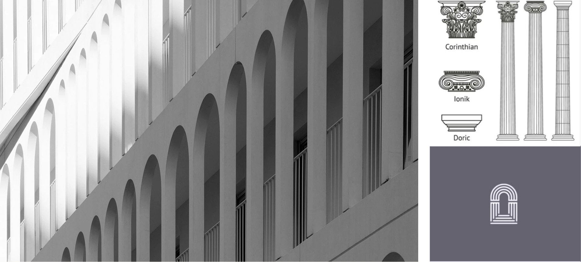
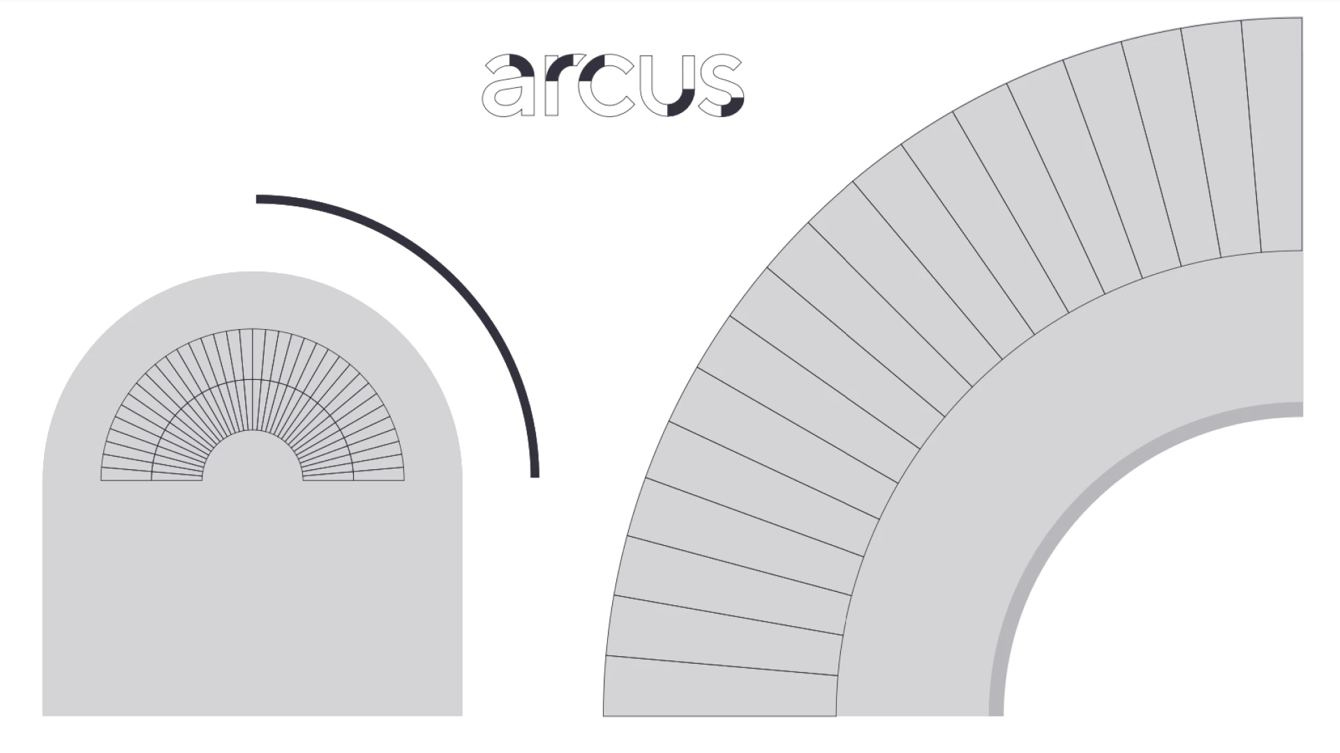
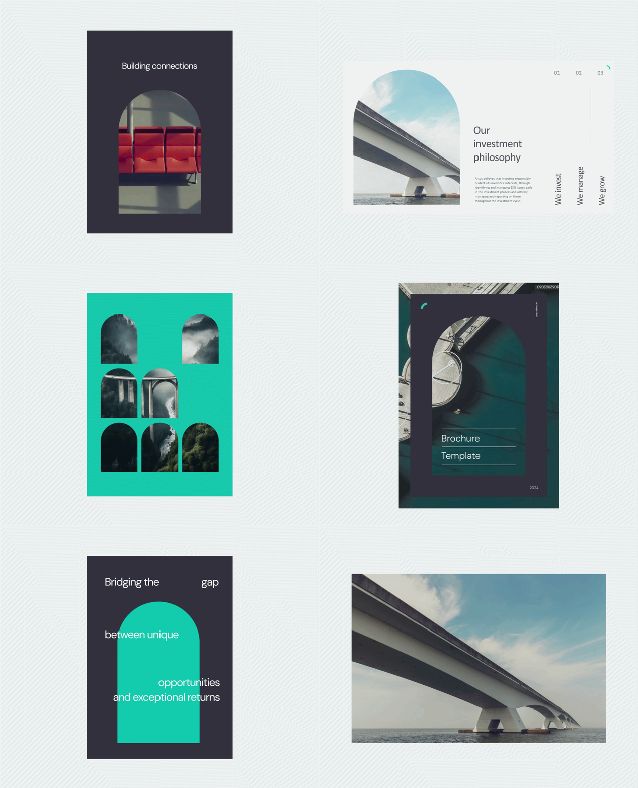
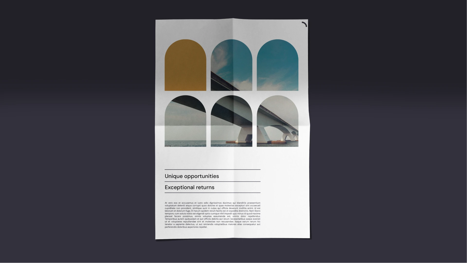
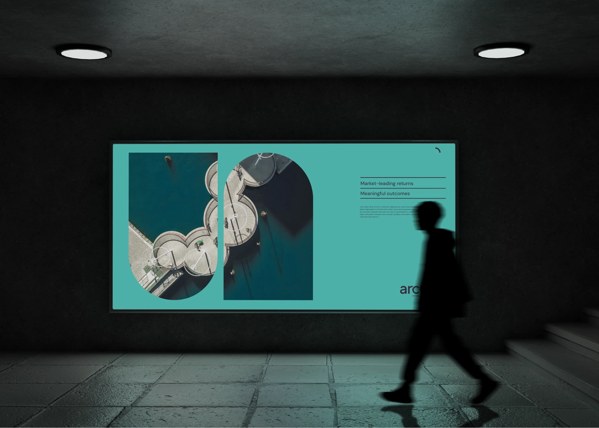
The solution centred on the Arc itself. Derived from Arcus's architectural heritage (they work extensively with bridges), it became the unifying visual language - functioning as icon, photography mask, signature. Everything else built from that foundation: refined colour palette, clear typography, organized hierarchy. Three strategic themes (structural, kinetic, human) informed the direction but never fragmented it. Instead, they reinforced a single message: this is a firm built on solid ground, moving with confidence.
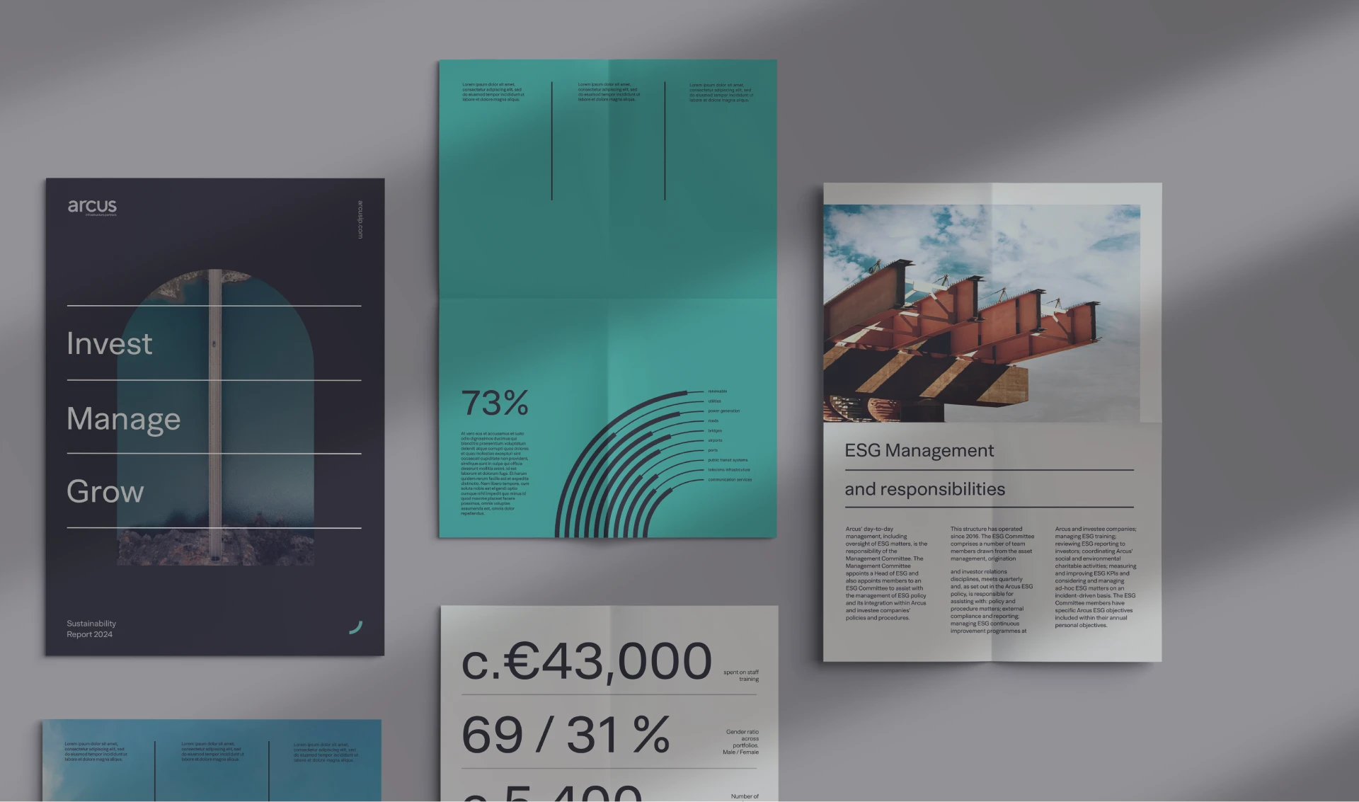
The result communicates what the business actually is - systematic, reliable, strategically focused. Every application follows the same logic. There's no noise, just necessary elements in service of the brand's intention.
Art direction & brand rollout
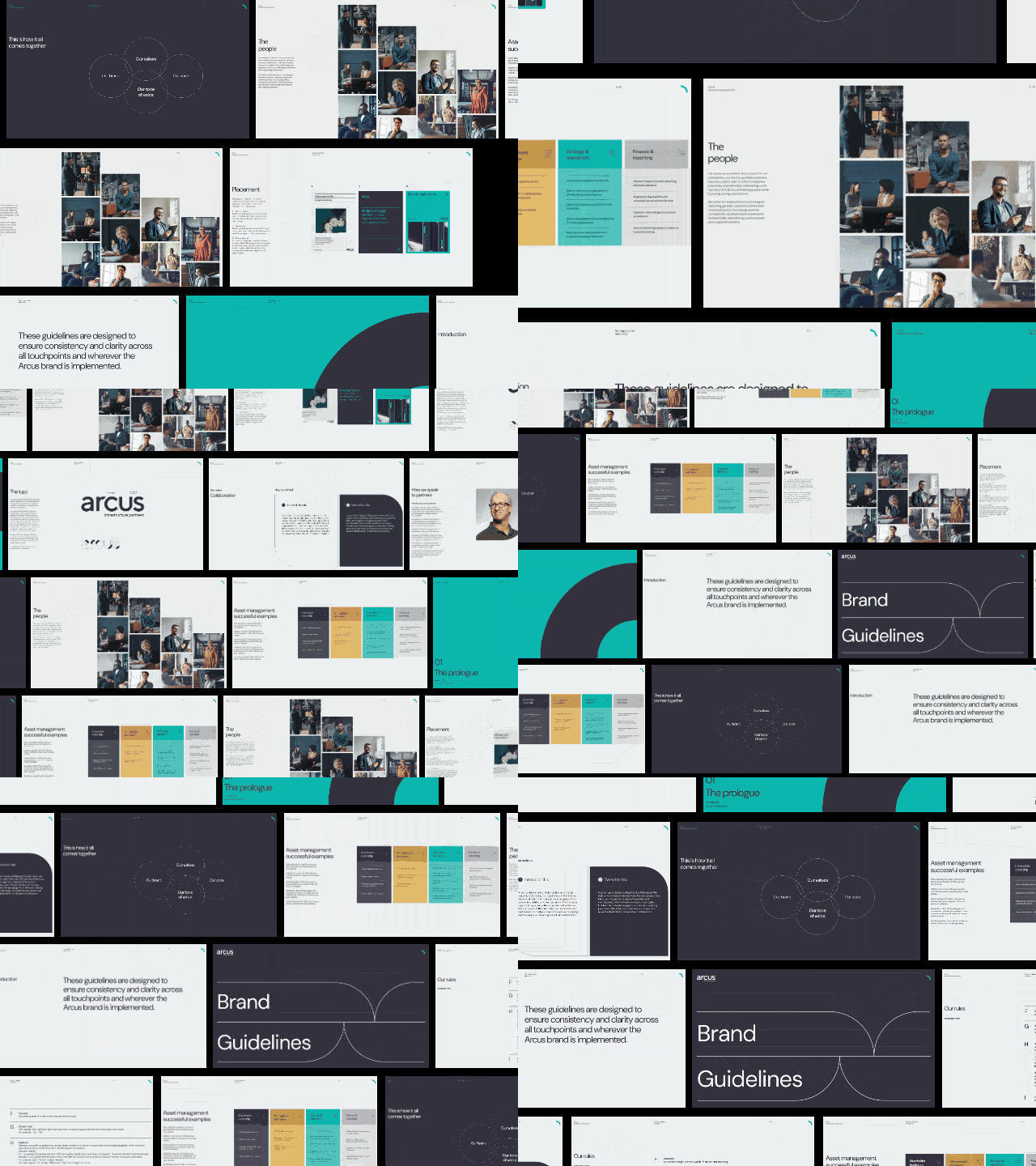
Brand guidelines execution
Print & digital applications
Collaborated with Art Director and design team
Led execution across multiple brand touch points