Unu: Evolution without dilution
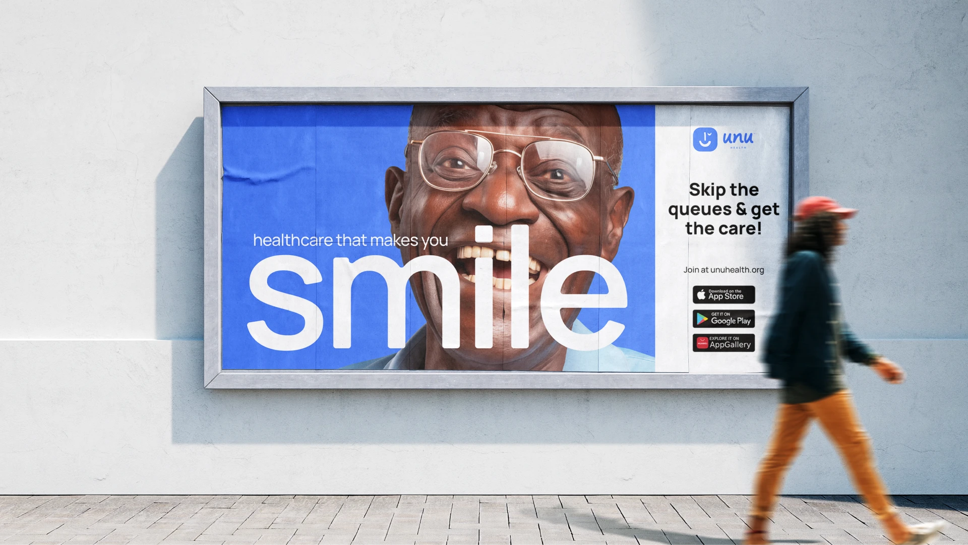
Unu Health launched into a fragmented South African healthcare landscape with an identity built for accessibility and trust. But a platform that works for one audience segment doesn't automatically work for all. Over years of growth - partnerships with Standard Bank and Pepkor, campaigns across shopping malls and awareness channels - the brand had to evolve without losing itself.
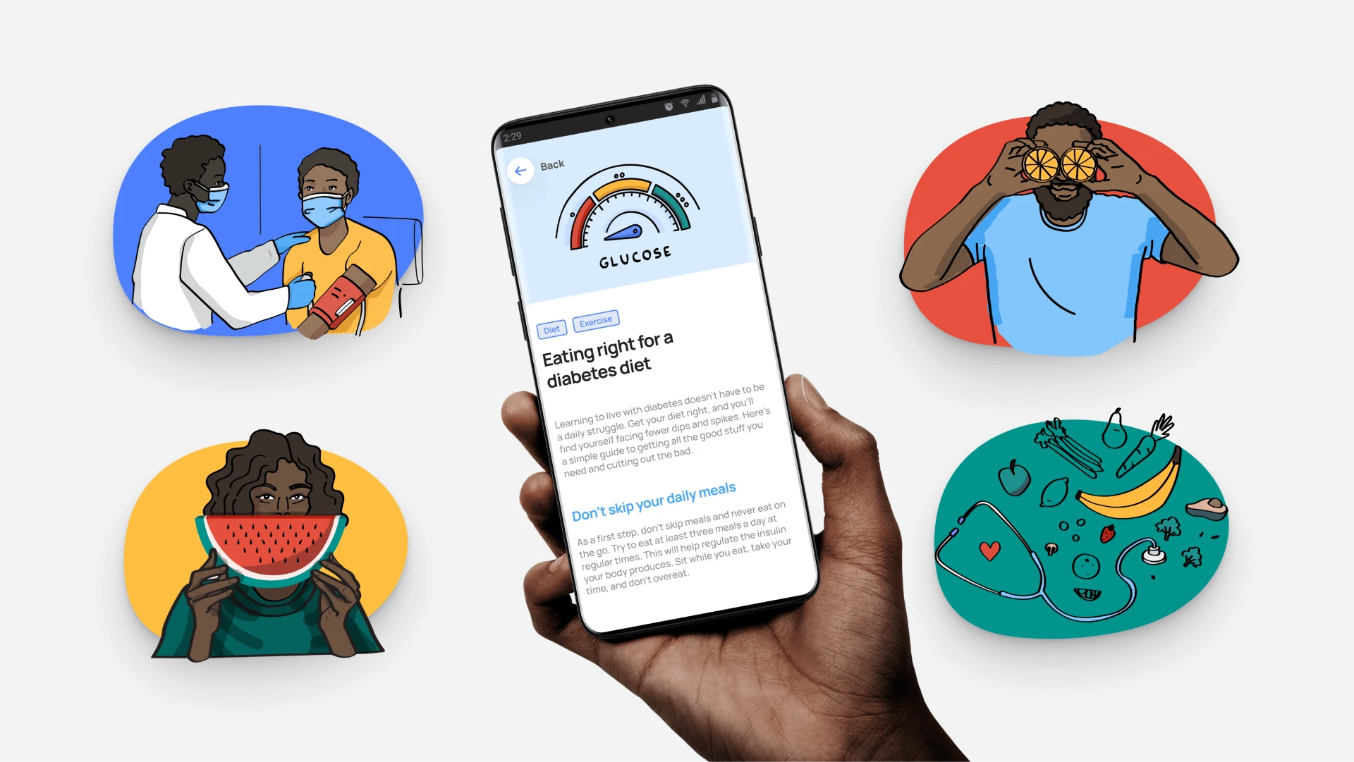
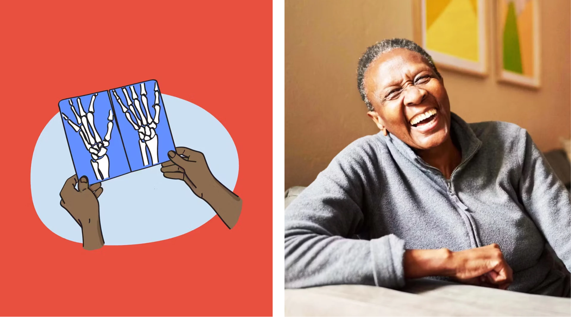
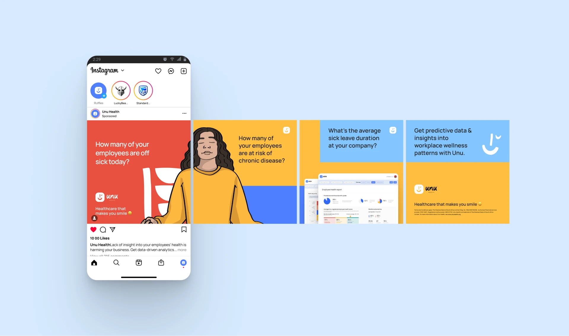
The work centred on controlled iteration. The core (logo, colour, typography) remained fixed; everything else flexed. Shapes, illustrations, animations, layouts shifted to speak to different audiences and contexts while maintaining visual coherence. Each campaign tested what could be added to the system without compromising the brand's strength. The result was a platform that felt fresh and responsive without becoming scattered or diluted.
What matters is the discipline: knowing what to hold constant and what to evolve. Unu's brand grew because the visual system could breathe in different contexts without losing credibility.
Brand rollout & evolution
Graphic design
Digital & campaign materials
Worked within established brand guidelines
Collaborated with design team and Creative Director